Hainan Airlines — Booking App Redesign
ClientHainan
Year2025
Domain数字设计 / UI & UX
EngagementResearch / Design / System
BACKGROUND
Background
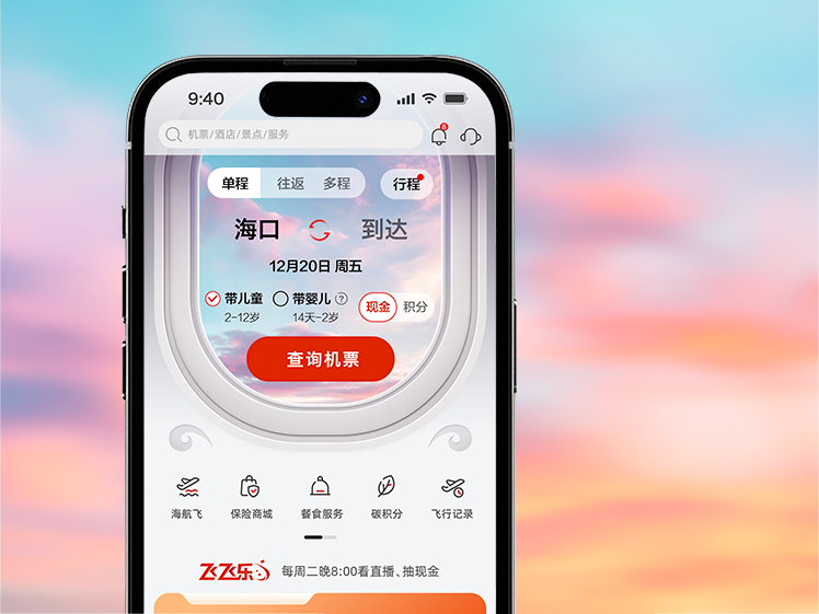
Hainan Airlines wanted to shed the "legacy airline app" feel and meet a new generation of business travellers as a younger, smarter brand. The old app required seven steps to book a ticket, with overloaded result pages.
CHALLENGE
Challenge
Cut the core booking flow from seven steps to under four, and make search results genuinely scannable — so price and time decisions become obvious at a glance.
APPROACH
Approach
We rebuilt the search home as a single "one card does it all" surface, supporting multi-city and flexible-date queries in one input. Results render as a timeline plus price bar, so departure spread and price tiers read together. Subtle motion guides the eye between steps and reduces the cognitive break of full page transitions.
User research & scenario mapping
Map target users, key touchpoints and information priority. Pin down what the page should solve first.
Visual language
Define colour, typography, image ratios and rhythm so the project speaks with one voice.
Components & design system
Break key modules into reusable structures spanning lists, details, showcase and conversion flows.
Hand-off & delivery
Multi-device adaptation, copy placement and detail polish to keep visuals and experience unified.
OUTCOME
Outcome
Booking completion rose 32% and average steps per booking dropped from 7 to 3.8. Hainan's digital team has since rolled the design system out to the website and Mini Program.
3×Design throughput
400+Deliverables shipped
NEXT PROJECT