DJI Power — Mobile App Design
ClientDJI
Year2025
Domain数字设计 / UI & UX
EngagementResearch / Design / System
BACKGROUND
Background
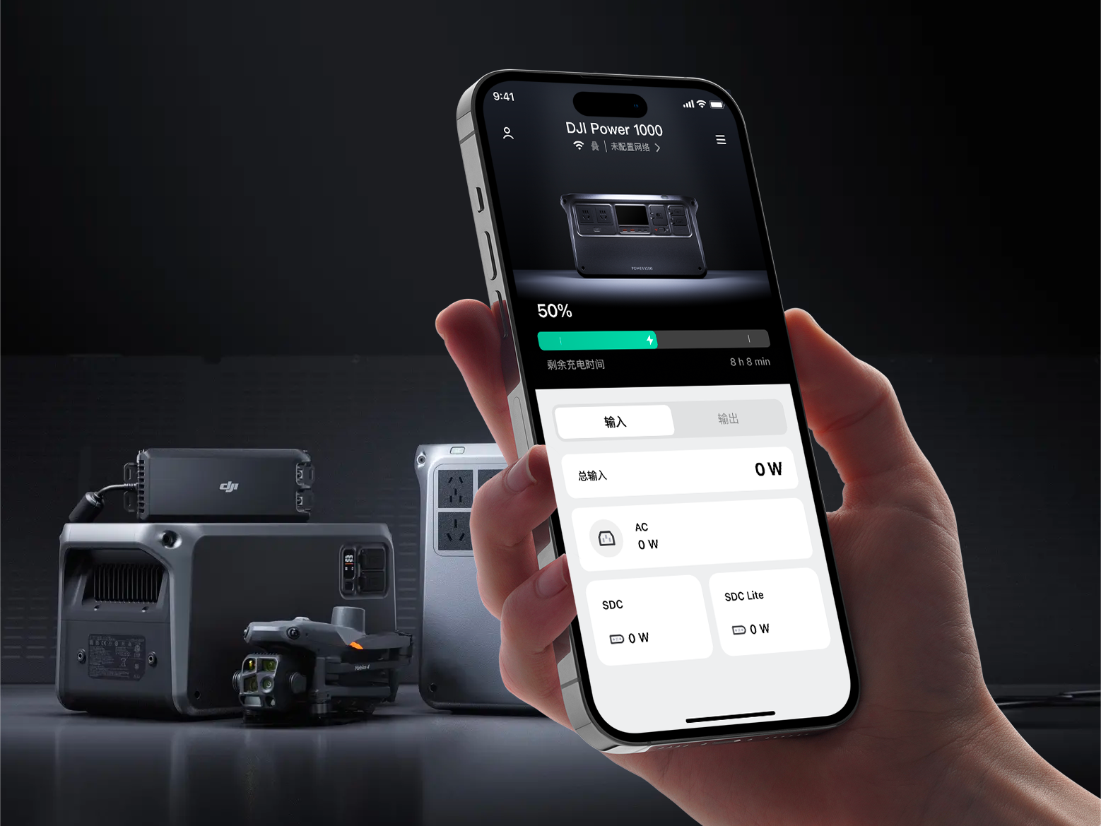
After its drones, DJI launched the DJI Power line for outdoor and emergency power markets. The brief to Linggu was clear: the app had to feel of-a-piece with the DJI brand, while making the complex world of battery telemetry instantly readable.
CHALLENGE
Challenge
Lower the cognitive load of an outdoor power product so users can read remaining capacity, charge/discharge state and port allocation in three seconds — while carrying DJI's signature engineering and quality language throughout.
APPROACH
Approach
We built the interface on a dark, high-contrast data-card system, breaking dense circuit information into a drill-down information architecture. Geometry, sharp dividers and accent data colours echo the DJI product family. Motion uses physics-based easing so charge/discharge transitions feel like real energy flowing.
User research & scenario mapping
Map target users, key touchpoints and information priority. Pin down what the page should solve first.
Visual language
Define colour, typography, image ratios and rhythm so the project speaks with one voice.
Components & design system
Break key modules into reusable structures spanning lists, details, showcase and conversion flows.
Hand-off & delivery
Multi-device adaptation, copy placement and detail polish to keep visuals and experience unified.
OUTCOME
Outcome
96% positive reviews on launch. Screenshots circulated through outdoor-power communities on day one. DJI's own team called it "the closest a software interface has come to the quality of our hardware design."
3×Design throughput
400+Deliverables shipped
NEXT PROJECT