

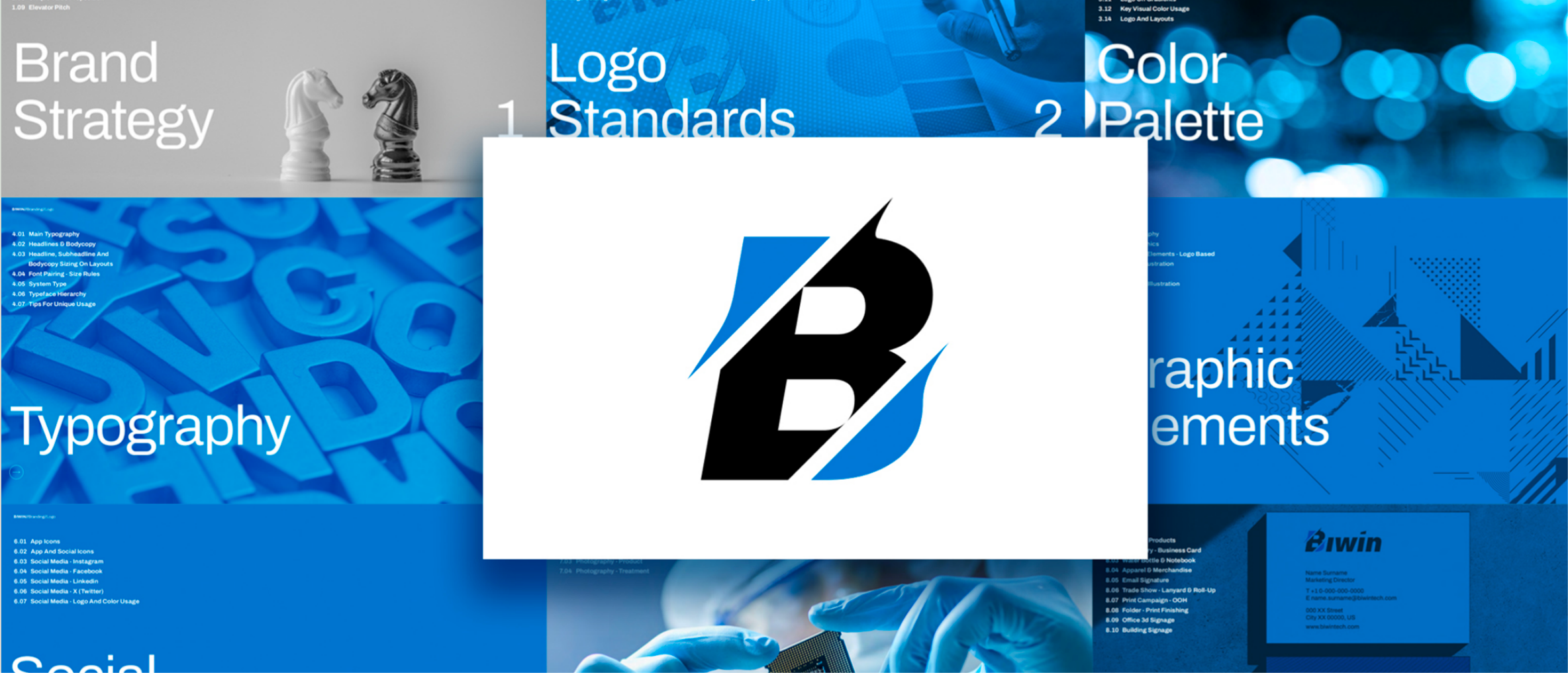
X-TRANSFOT — Brand Identity System
ClientX
Year2025
Domain创意方向 / UI & UX
EngagementResearch / Design / System
BACKGROUND
Background
X-TRANSFOT is a three-year-old cross-border logistics technology company. Rapid growth had left its visual brand fragmented — website, app and collateral each pulled in different directions. The team needed an identity that could carry their "technology-driven international logistics" positioning across everything.
CHALLENGE
Challenge
Build an identity system covering logo, colour, type and graphic language, and apply it across the website, app and admin console as one consistent surface.
APPROACH
Approach
The mark builds out of the letter X to suggest both speed and stability. The palette pairs deep blue with silver-grey, deliberately stepping away from the blue-orange common to the category. The graphic language is built on monospaced rules and geometric cuts, echoing the precision logistics demands. The full VI is delivered as a scalable design-token system adaptable to light and dark digital modes.
User research & scenario mapping
Map target users, key touchpoints and information priority. Pin down what the page should solve first.
Visual language
Define colour, typography, image ratios and rhythm so the project speaks with one voice.
Components & design system
Break key modules into reusable structures spanning lists, details, showcase and conversion flows.
Hand-off & delivery
Multi-device adaptation, copy placement and detail polish to keep visuals and experience unified.
OUTCOME
Outcome
Three months after launch, average time-on-site rose 60% and overseas enquiries doubled. Client feedback: "We finally look like a real tech company."
3×Design throughput
400+Deliverables shipped
NEXT PROJECT